
About 12 years ago, I made a career change with the aim of improving the usability of electronic health (EHR) records. A little side project was a monthly morning salon called "Geek Salad: Tossing Ideas Around". At a local coffee shop, we commandeered the large display to marvel at some recent discovery (a new software tool, stunning data visualization or creative spark one of us had.) We met for 2 years, and the time came to let it go.
Seeing more by showing less in physician notes
We just published our research testing whether a new dynamic physician note design would be better (faster to read, able to find correct information more often) than today's typical EHR note. The new designs had advantages.
You can read the article here:
Dynamic Electronic Health Record Note Prototype: Seeing More by Showing Less
Assessment and Plan to the top

Figure 1.
Four model notes were compared. A is the traditional SOAP note. B, C, and D move Assessment & Plan to the top. The second column demotes some content's visual importance.
The easiest change to make (B, C, and D above) is putting "Assessment and Plan" at the top of the note. That's where readers go the vast majority of the time. Other parts of the note are used less often, and then mostly to find a specific detail. Making this change is technically easy. Readers understand it. It makes writing a note no more difficult than it is now.
Two-column note sweeps pesky old details to the side
A second improvement is also fairly easy to make (B and D), and has been implemented in a number of EHR platforms already. I posted about this years ago (A Beautiful EMR Note!) when I first saw such a note from eClinical Works. This moves the "lists and the past" to one side in a smaller subsidiary column. The main story (Present Illness, Exam, and Assessment and Plan) all stay in the wider main column. The reader finds relevant details faster because the more stable background details are swept to the side. This reduces visual clutter and information overload.
Seeing more by showing less
What if readers could find the sought-after details more easily by removing visual distractions? Physicians know that some parts of the notes are lists, mostly normal, but with scattered abnormal details which happen to matter most. If those lists would highlight the details that matter (the abnormals, such as "cough, fever, nausea" in the Review of Systems, or "redness, tenderness, swelling" in the Physical Exam) and visually subdue or hide the boring normal list items, then readers could see more by showing less.
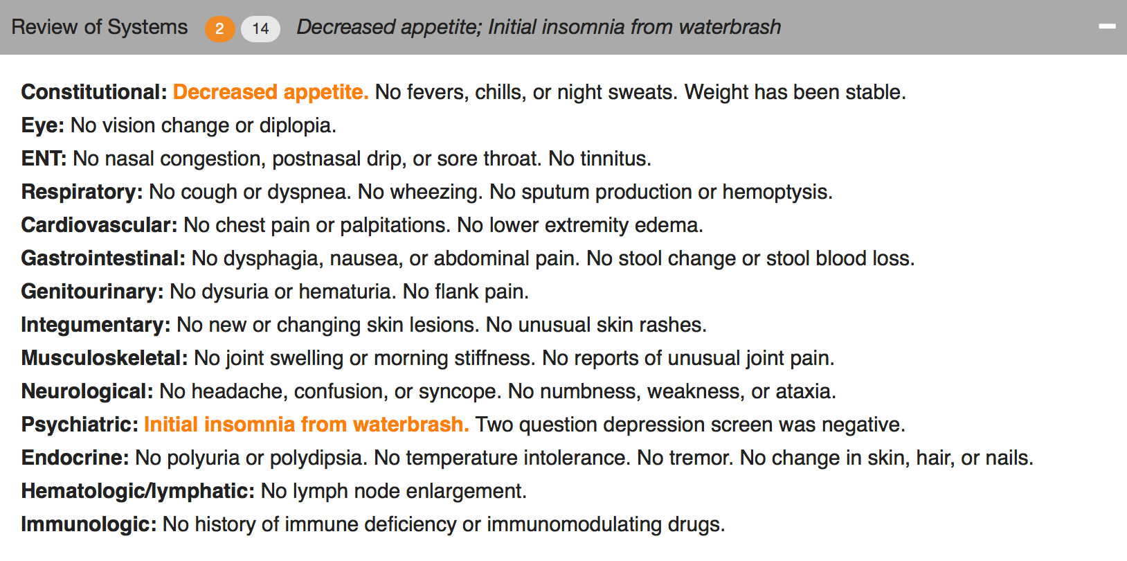
Figure 2. The header can collapse and still reveal the important abnormal details.

Figure 3. Collapsed, showing only the header.
We used a couple of approaches. One was to make the abnormal terms bold and color, but leave the terms among the list text. The other was to extract the abnormal text and just display it in the header for that section (e.g. the Physical Exam), along with a "count" of abnormal items.
The challenge to implementing this is identifying the words that are abnormal.
“Abnormal values may be identified by several different mechanisms. When words are selected as discrete data elements when physicians create the note (eg, clicking on the word “fever”), it is easy and measurable if each item carries a designation as abnormal or not. Typed or transcribed text is more problematic to identify as abnormal. Natural language processing can be employed after the note is completed but adds cost, complexity, and ambiguity. Abnormal lab values can be expected to arrive with a flag denoting ab- normality (eg, a serum potassium result will have a flag for high, low, or critical if outside the normal range). If the labels of abnormality are not consistently reliable, users will not trust the information display, and its utility will suffer dramatically.”
Changing expectations for physician documentation
I think we are on the cusp of a new era when documenting the lists (used to count bullet points for fee-for-service billing) will be less necessary to prove our work as physicians. Instead, we can refocus on the patient's story, our clinical reasoning, and the plan of care, while letting the health record database carry the burden of collecting and displaying information in a meaningful way that reduces the cognitive workload of the physician. Data visualizations, dashboards, and focused reports can carry the weight that until now has been shouldered by physician notes. It's time for a change.
As patients (aka "consumers of healthcare"), we should be paying for outcomes instead of bullets.
Dear Registry: Stop Saying I Have Diabetes

I went to see my family physician for my annual visit. He mentioned that the chronic disease registry listed me as having hypertension and diabetes. That's not so, and my family physician recognized the registry assignment errors immediately.
Says who?
I know where each of those mistakes arose. On one occasion 2 years ago, I had minimal elevation of my blood pressure, and many subsequent normal blood pressures. And in 2013, I attended an employee health screening (fingestick specimens) where I had a barely elevated fasting blood sugar of 108, with a normal upper limit of 100. The actual diagnostic criteria for diabetes are either a blood sugar 126 mg/dL or higher, or an A1C level 6.5 percent or higher on two separate occasions. I certainly don't qualify for the diagnosis of diabetes by either criteria.
What went wrong?
There must be a rule in my doctor's population health registry model that says "single abnormal value = disease", even though that is almost never the rule from the physician perspective.
For my healthcare organization to really manage population health, all the parties will need to trust the data and its analysis, and both must be trustworthy. The most convenient data (a single measure, misapplied in my case) may not be meaningful or trustworthy. The analysis can't just be trustworthy 70% of the time.
Good data + good models = good analysis
Good data + faulty models = faulty analysis
Understanding a population health registry takes hard work and clinical insight. When the data comes from multiple sources, such as billing diagnoses, clinical records, and from payment sources, there are many opportunities for error. Your team needs to understand the source of every data element.
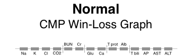
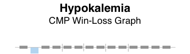
Win-Loss Graphs: Method for displaying lab panels concisely
How do we balance thoroughness and conciseness when displaying lab results? Some clinicians prefer viewing the selected results most likely to be actionable. Some prefer to see all results all the time. Are there approaches that meet both needs? Let’s try to display all abnormal results concisely while revealing that other results are in the normal range without necessarily showing the numbers in a tabular field.
Win-Loss graphs show deviation from expected range
We can represent all elements of a CMP (comprehensive metabolic panel) in a bar graph called a win-loss graph. Upward bars for win-loss graphs in a sports setting typically represent a win, while downward bars represent a loss. In our clinical setting, we let upward bars represent abnormal high values while downward bars abnormal low values. Critical values can be rendered with more intense color or longer bars, or both.
BMP (basic metabolic panel)
Here’s a win-loss graph for a normal BMP result. The individual test names are shown. The vertical dividers separate the functional elements of the graph sections: electrolytes | renal function | other.

Normal BMP win-loss graph
CMP (comprehensive metabolic panel)
Here are win-loss graphs for a CMP with and without the labels for individual test names. The functional elements can be described as: electrolytes | renal function | other | proteins | liver function.
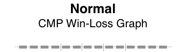
Patterns of abnormality
Patterns often reveal clues to disease. Here, the graphical patterns reveal abnormality without displaying discrete numeric results. This is of most benefit when the results are normal, the trends of change are not significant, and the numeric details are readily available with low effort.
Here are a few examples.
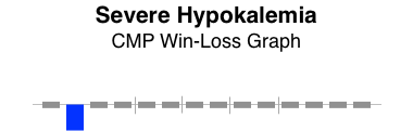


The win-loss graph does not display time trends well, but does give a “sparkline” (word-sized graphic) snapshot of a lab panel at a single point in time. There will be some learning involved to recall the location of each individual test, but the vertical separators make that easier. Alternatively, displaying the lab test names takes up very little additional space.
When designing dashboard displays of various clinical parameters for a single encounter (clinic visit or daily hospital visit), the win-loss graph can concisely display that abnormal values in a lab panel (such as BMP, CMP, or CBC) exist, while confirming the normality of all the other individual elements of the lab panel.
Thoughtful reporting
I just got a report from a neurologist at University of Missouri Health Care. It gave me delight! Why?
Here's the text:
“Conclusion:
This study shows evidence of severe carpal tunnel syndrome on the right side with ongoing denervation. There is no evidence of neurogenic thoracic outlet syndrome. Nerve conduction EMG does not rule out vascular thoracic outlet syndrome.
Abbreviations:
NCS= nerve conduction study
SNAP= sensory nerve action potential
CMAP= compound muscle action potential
MUP= motor unit potential
EMG= electromyogram
F IBS= fibrillations
PS W’s= positive sharp waves
Raghav Govindarajan, MD, (ABDA)”
What's delightful about carpal tunnel syndrome?
Nothing really. Getting a report that clarifies the diagnosis is often a relief for my patient who has been wondering what is causing their weird symptoms that stumped me, the family physician. Knowing it's a treatable problem helps. Knowing what it's NOT is often a relief: "It's not a stroke. It's not cancer."
DELIGHTFUL TO ME
This report was delightful to me as a physician dedicated to clear communication.
The diagnosis is clear, and written in plain language with the proper clinical terms (not just lay language). The list of abbreviations shows consideration for the reader.
There's a warning about what has NOT been excluded diagnostically: "Nerve conduction EMG does not rule out vascular thoracic outlet syndrome."
The whole "Conclusion" is a clear, tight, thoughtful package.
Golden Apple

It might be no surprise to learn that this physician was also recently awarded the National Golden Apple Award for Teaching Excellence by the American Medical Student Association.
Workflow: not as simple as it seems
Sometimes we consider workflow in the context of electronic health record (EHR) usability. We imagine workflow is a series of steps that are performed, usually in sequence, but sometimes with some variation in the sequence of steps. It's far more complicated. Holman et al [JAMIA 2015 Sep] recently published a report analyzing a large number of primary care physician workflows to conclude:
PCP workflows were unpredictable during face-to-face patient visits. Workflow emerges as the result of a “dance” between physician and patient as their separate agendas are addressed, a side effect of patient-centered practice.
Some workflows can be fairly simple. For instance, e-prescribing refills of a single medication (generic oral contraceptive) for a woman returning for her annual well woman exam. She has the same job, the same insurance plan, the same copay amounts, and the same medication. These details make this particular e-prescribing workflow simple. This can be done with fast, recognition-based, System 1 thinking which takes little cognitive effort. [Kahneman, Thinking, Fast and Slow].
Now by contrast, imagine an older patient with 8 different medications and as many chronic problems. Some of the medications are more expensive, because they're not available generically. Thus there are more opportunities for dug-drug and for drug-disease interactions. There may be opportunities for dual benefits from a new prescription that benefits more than one problem. If the insurance plan has changed since last year, then copays and coverage may be significantly different and thus require the attention of the physician and patient. In some cases, prior authorizations may come into play. This process requires system 2 thinking, deliberative, slow and effortful, and requiring sustained attention.
To appreciate the underlying complexity and mental effort, let's take a look at a simple e-prescribing workflow model, and then drill into the details.
e-Prescribing Workflow

Here's a diagram showing a simple e-prescribing workflow. The physician reviews the current medications and problems, takeing care of any renewals needed. Some of the medications may need adjustment, such as a change in the number of daily tablets, switching to a new drug strength, or stopping the medication. New medicationss may be prescribed. Finally, the physician and patient have a conversation about what to expect from the new medication. Written materials may be provided by the physician, although pharmacies provide those written materials more commonly.
Medication Reconciliation
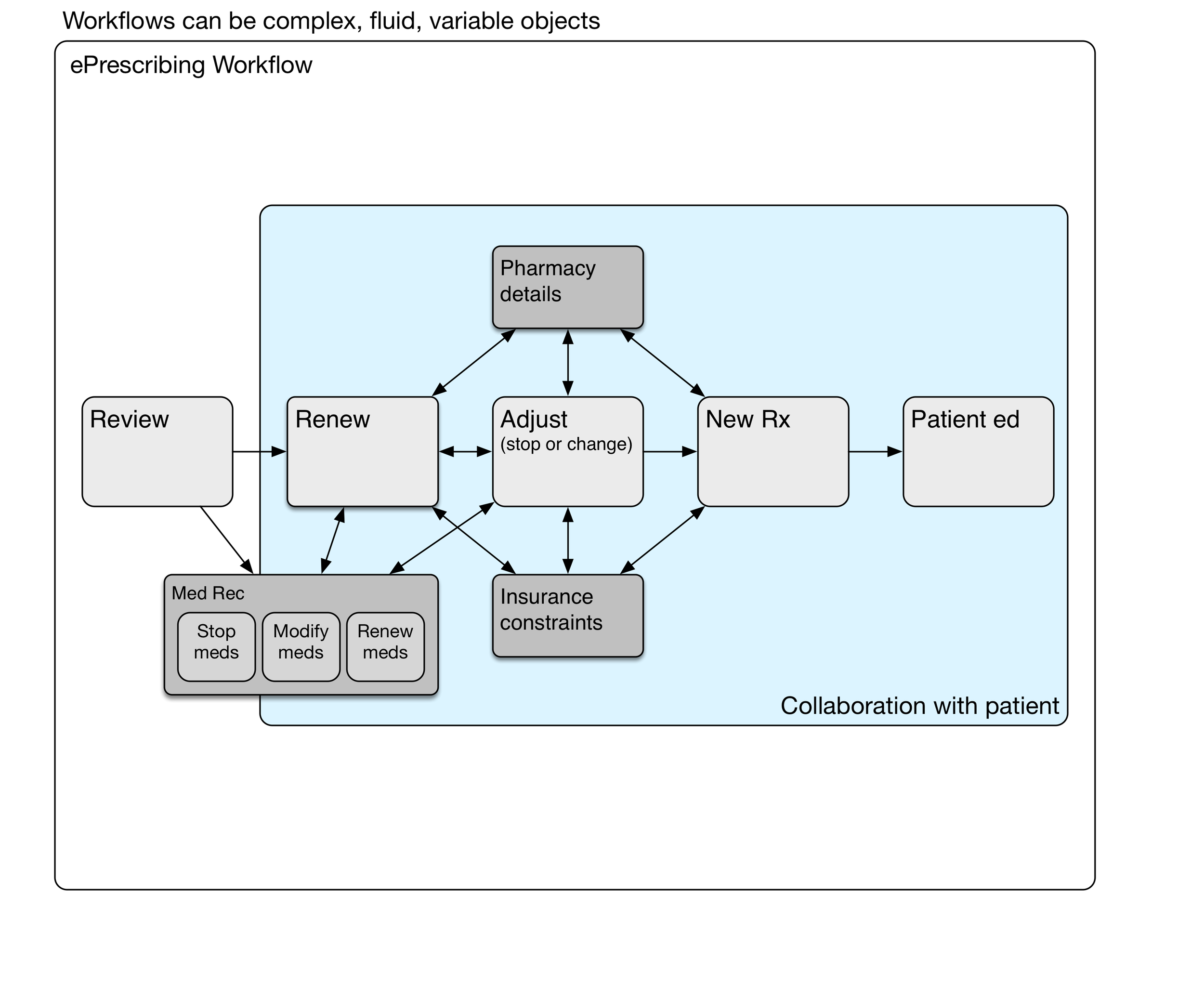
Medication reconciliation may be done at the review stage, during medication renewal, or later adjusting medications.
We haven't mentioned medication reconciliation (med rec) yet. It may be a part of some ambulatory encounters, particularly after transitions of care such as hospitalization or emergency department visits where medication lists have been changed. When should med rec be done? Can it be done more than once during the encounter? Does it need to be done for every encounter? Medication reconciliation is a sidetrip in the e-prescribing workflow.
Renewing Medications

The timing of the next appointment determines which meds need to be renewed.
The decision to renew a particular medication depends on when the next anticipated visit would occur. Sometimes this is a matter of routine, such as every three or six months for someone with diabetes. That maybe once a year for somebody with high blood pressure. Fairly often, the interval is determined by newly identified clinical needs and negotiation between the patient and physician.
Pharmacy Details

Hotter colors (red, orange) depict greater cognitive load.
Sometimes it's simple. For an annual visit with no new medications and nothing changed, renewing all the medications may be as simple as a handful of clicks. However, if different prescriptions have different destinations (controlled substance prescriptions must be printed, some go to a mail order pharmacy for a 90 day supply, and others go to a local pharmacy for a 30 day supply), then it can get complicated. System 2 thinking again.
Insurance constraints
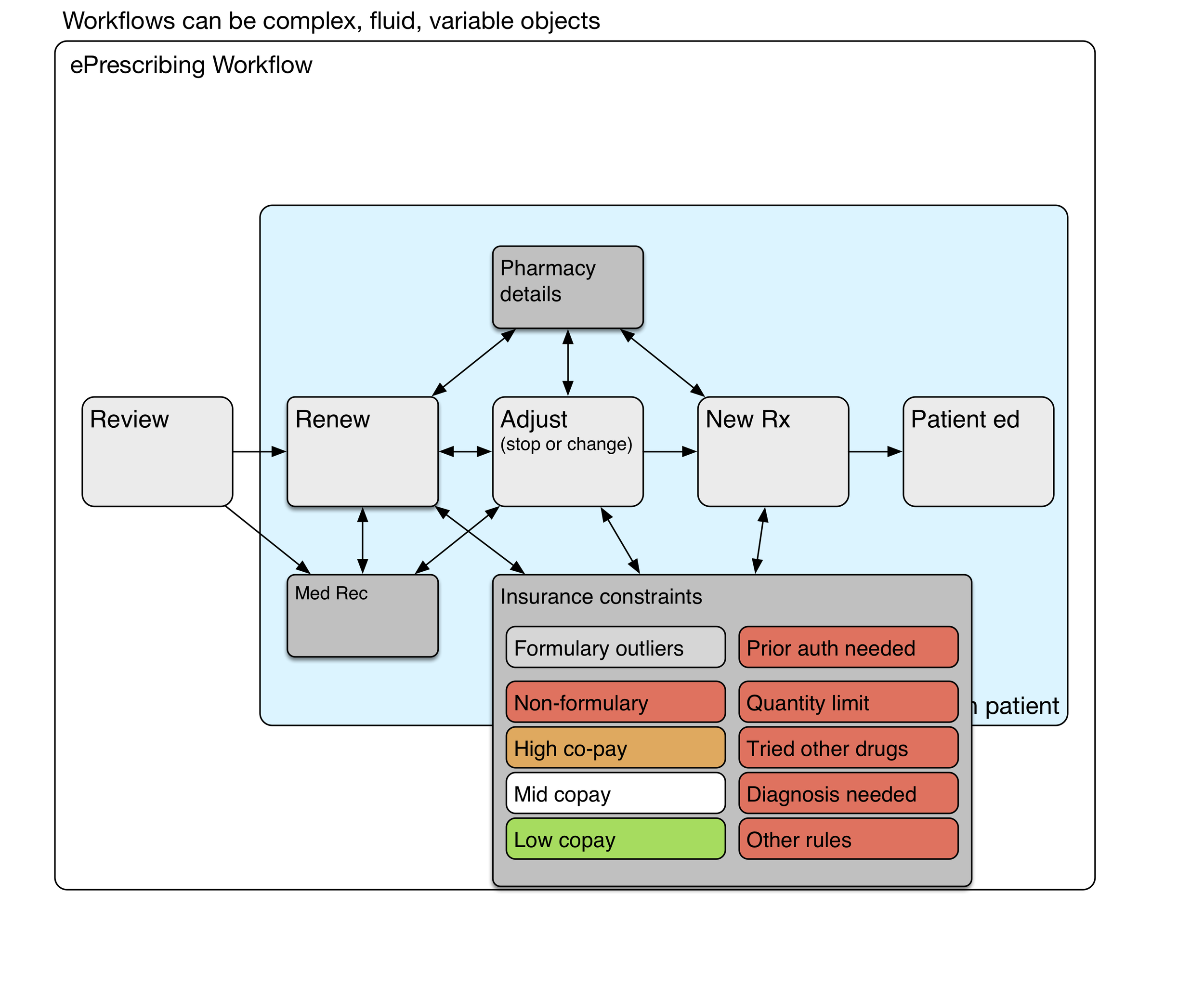
Hotter colors (red, orange) depict greater cognitive load.
Depending on the insurance formulary, some medications may have higher co-pays, and those copays can be unaffordable for many patients. Formulary visual cues at the point of care can lighten the physician's cognitive load somewhat. Nevertheless, it takes deliberate effort to find formulary alternatives that will be less expensive for the patient. The choice of an alternative medication is a collaborative process involving the patient.
Some medications (expensive, risky, or commonly overprescribed) require prior authorization by the insurance plan. This is a time-consuming process that will occur after the physician visit has been completed.
Workflow and subroutines
These subroutines are the deeper processes that are mentally effortful, variably performed, even sometimes avoided (due to time constraints or a physician's saturated mental capacity). The system 2 thinking it requires carries a heavy congnitive load. Remember that health IT workflows can be quite variable and complex
Discrete data kills a story
This is a faxed note from a physician’s office about someone you don’t know.
This is fairly typical of a modern EHR note “created” (or stillborn) by clicking on word choices from a list. The lists are designed with an eye toward being able to bill for the actual work done during the visit. The result is awful. Every doctor in the world would agree.
We can do better. We must try. Think of the reader caring for this patient later.


This would have said the same thing:
He is here to follow-up on his SLE with renal disease, moderate proteinuria, hypertension, and hyperlipidemia.
A slightly more readable version (because it's a list) would be:
He is here to follow-up on his:
- SLE with renal disease
- moderate proteinuria
- hypertension
- hyperlipidemia
I think we physicians need to tell patients' stories, not just collect bullet points for billing. A well crafted, readable narrative will contain the data to justify the billing. If our typing skills are weak, we can learn voice recognition.
Sketching bad ideas for medication timelines
Sketching timelines
I first started thinking about graphical timelines when our team at University Missouri was working with our electronic health record vendor, Cerner, on a timeline for microbiology results (blood cultures and urine cultures). It was challenging to design timelines that were concise, intuitive, and effective.
A medication timeline will be far more helpful to me as a family physician, since I often struggle to understand a patient's medication history over the preceding years. it is difficult to find out when the medication was started or stopped, when it was was changed, and whether a medication had been tried in the past.
Fail early, fail often
I made a number of failed pencil sketches that I've shown here that were ineffective at handling the cognitive challenge.
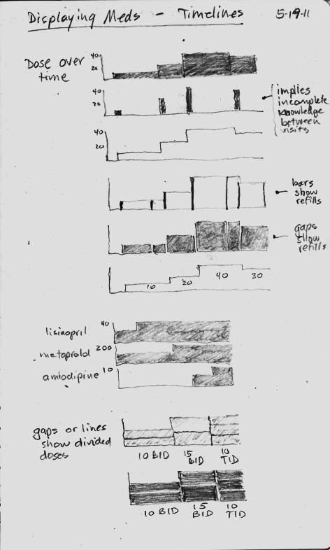
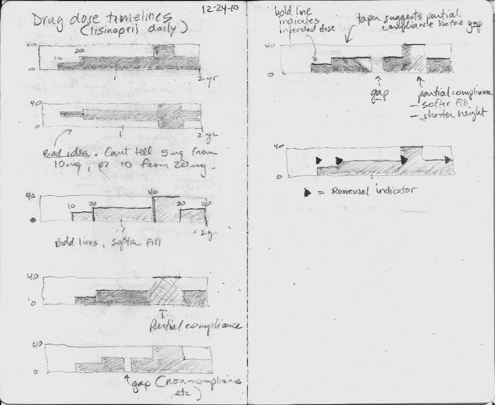
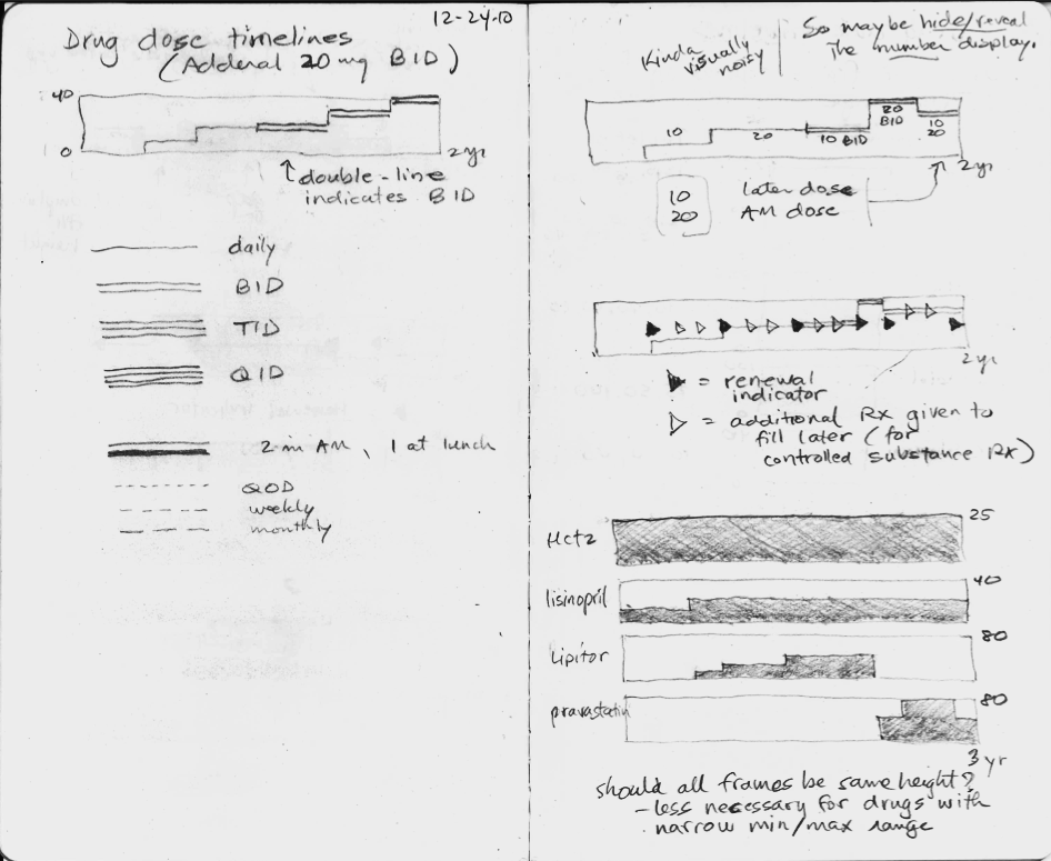
In the sketches, I explored using the height of the graph to display the dose, but none of the ideas really worked, mostly because they did not scale when the dose range could vary 16-fold or more. The dose of lisinopril can range from 2.5 mg to 80 mg daily, for instance.
Inspired by flight search
Then one day I was inspired by the beautiful and elegant visual design used by the flight search engine, Hipmunk. I immediately imagined an intuitive way to display a medication timeline.
In the process of making this online book, Inspired EHRs: Designing for Clinicians available freely online at inspiredEHRs.org, our design team had internal arguments about whether to make the timelines different hues of color, or whether to vary the line width of the bars. I think we made the right decision ultimately. By sticking with grayscale, we can then temporarily paint certain line categories different colors to give them visual meaning. For instance, all the hypertension drugs could be colored orange temporarily, to help the user see when the hypertension drug changes occurred.
Take the medication timeline for a spin
You'll find it here. See if it's intuitive you, or if there are some ways it could be improved. Let us know if you have feedback at inspiredEHRs.org/feedback. If you're aware of any EHR that is using a medication timeline, let us know at inspiredEHRs.org/feedback.